Data Visualization: Making Data Easier to Understand
They say a picture is worth a thousand words. In practice, data visualizations help convey meaning of the data more efficiently than text alone. In a highly data-driven world that demands evidence in the form of data and numbers, data visualizations help support our ability to digest and make sense of complex information. By learning about and using data visualization, public servants can be better equipped to draw meaningful insights from data and statistics to make evidence-based decisions.
While data visualization makes information easier to understand, it also carries risks. Poor data visualization can often become the root of misinformation, misleading claims, and inaccurate conclusions if not designed carefully and responsibly. As public servants, we have the responsibility of upholding the Values and Ethics Code for the Public Sector and present fact-based impartial evidence by using data visualization responsibly.
This article explores the fundamentals of data visualization, including what it is, common types of visualizations, the tools used to create them, key considerations, and best practices for their effective use. It also highlights how storytelling can help make the data and data visualizations more interpretable and actionable.
What is data visualization?
Data can be understood as facts, observations, or documentation about objects or phenomena presented in various forms. However, this information can be difficult to interpret, especially when it is structured or presented in ways that isn't familiar to all audiences; this is where data visualization comes in handy. By transforming data and statistics into charts, graphs, and other easy-to-interpret visuals, data visualization helps uncomplicate complicated information, especially for audiences with less technical expertise.
The importance of data visualization
Data visualizations are useful for a range of reasons. They transform data that may otherwise be difficult to interpret into clear and accessible visual formats that simplify the interpretation of numbers and statistics. By presenting information visually, they make it easier to identify patterns and trends, support the communication of insights through storytelling, and provide a foundation for more informed decision-making.
Common types of data visualization and how to choose the right one
Various subsets of data are best presented in different ways. As they vary in depth, types of assessments, area of focus, and the kinds of questions being asked of them, different types of data visualizations are often more appropriate than others. Choosing the most appropriate type helps ensure that the message within the data is clear, interpretable, and meaningful to the audience. Below is a non-exhaustive list of common types of data visualization used by the Government of Canada:
Bar, grouped bar, and stacked bar charts
Bar charts are one of the most widely used and easily recognizable forms of data visualization. They are particularly effective for helping audiences compare values across categories and identify differences or patterns. By representing data as bars aligned along common axes, bar charts allow for spotting notable gaps and detecting trends at a glance. An important point to always keep in mind when creating bar charts is that clarity and accuracy depend on how the data is presented. Axes and units must always be clearly labelled, and the proportions shown in the chart must accurately reflect the underlying data so that values can be interpreted correctly.
When using multiple bar charts for comparisons, it is also important to apply a consistent scale and labelling practices across all visualizations being compared. Differences in scale or poorly labelled axes can make results appear disproportionately significant or distort how differences are perceived, which may mislead the audience.
Example of a poorly designed bar chart
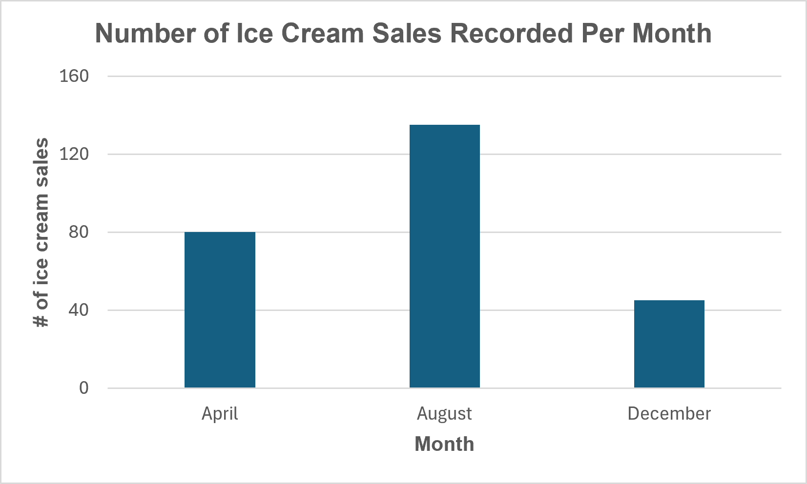
Chart A: Number of Ice Cream Sales Recorded Per Month (April, August, December)
Text version
Chart A Data
| Month |
# of ice cream sales |
| April |
80 |
| August |
135 |
| December |
45 |
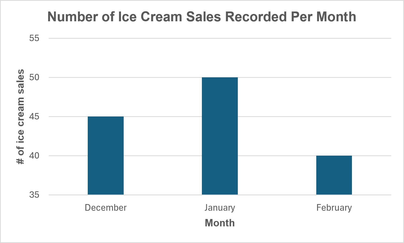
Chart B: Number of Ice Cream Sales Recorded Per Month (December, January February)
Text version
Chart B Data
| Month |
# of ice cream sales |
| December |
45 |
| January |
50 |
| February |
40 |
These bar charts demonstrate how axis scaling can influence how data is interpreted. While the bars in both charts appear similar in shape and size, the values that they represent are very different. Chart A shows a much wider range of values than the chart on the right, but the adjusted axis that does not start at zero in Chart B makes comparatively small differences appear larger. Moreover, poor scaling can create a misleading impression of the magnitude of differences in the data, increasing the risk of inaccurate interpretation and conclusions. Using consistent scales and clear labels helps reduce the risk of comparisons being misinterpreted.
Bar charts consist of vertical and horizontal axes, and bars that represent different values of the variables on the axes. Bar charts can be displayed in vertical, horizontal, grouped and stacked manners, with the most common being vertical.
Grouped bar charts
Grouped bar charts are a variation of bar charts that build on the standard format by allowing multiple values to be shown side-by-side within each category. This is an effective type of data visualization when comparing how values within a single category differ with additional variables, stratifying the results by a third variable. A factor to always consider when using grouped bar charts is how it may quickly become cluttered and confusing to read and decipher if there are too many groups or categories.
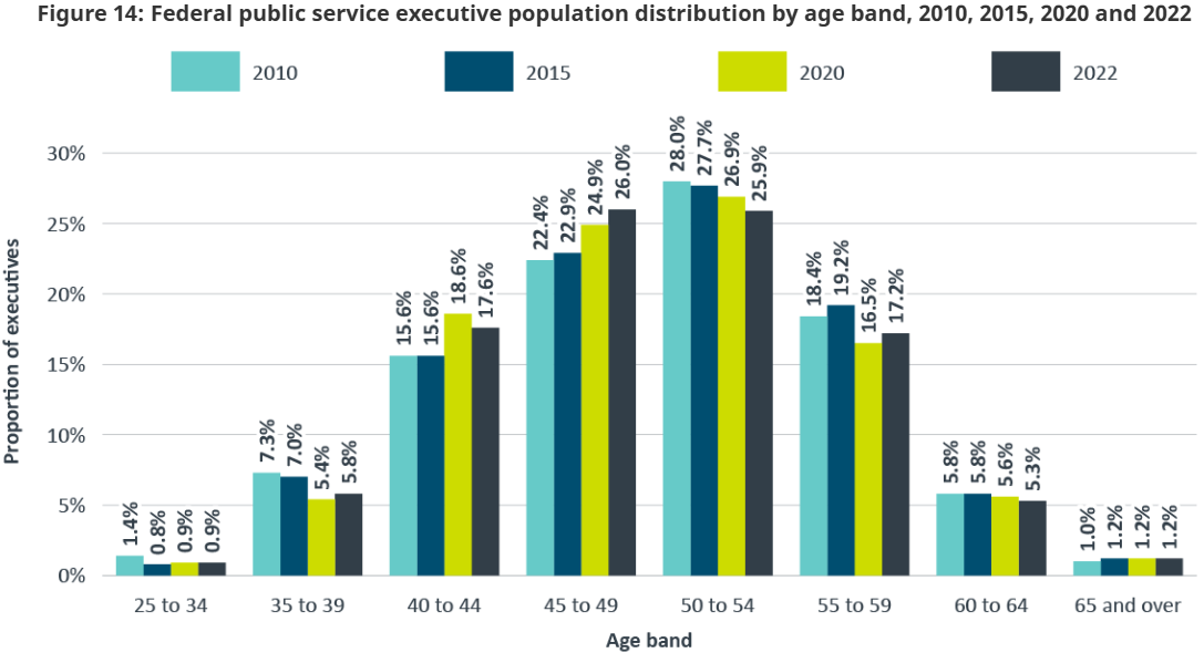
Grouped bar chart example: Federal public service executive population distribution by age band, 2010, 2015, 2020 and 2022
Text version
Federal public service executive population distribution by age band, 2010, 2015, 2020 and 2022
Percentage distribution by age band and year
| Age band |
2010 |
2015 |
2020 |
2022 |
| 25 to 34 | 1.4% | 0.8% | 0.9% | 0.9% |
| 35 to 39 | 7.3% | 7.0% | 5.4% | 5.8% |
| 40 to 44 | 15.6% | 15.6% | 18.6% | 17.6% |
| 45 to 49 | 22.4% | 22.9% | 24.9% | 26.0% |
| 50 to 54 | 28.0% | 27.7% | 26.9% | 25.9% |
| 55 to 59 | 18.4% | 19.2% | 16.5% | 17.2% |
| 60 to 64 | 5.8% | 5.8% | 5.6% | 5.3% |
| 65 and over | 1.0% | 1.2% | 1.2% | 1.2% |
Source: Office of the Chief Human Resources Officer, Treasury Board of Canada Secretariat.
Technical Notes: Population: Includes all federal public service executives, specifically, core public administration executives and their equivalents in separate agencies (such as Executive group (EX) and Management group (MG) classifications) in all tenures (indeterminate, term and casual). It does not include executives on leave without pay.
The information provided excludes employees with an unknown age and is based on data as of March 31.
Stacked bar charts
Stacked bar charts are variations where the data is displayed in a horizontally or vertically stacked way. This presents values as segments within a single bar, showing the different components that contribute to a total. This type of data visualization is useful when illustrating proportions of a set of data, while still allowing for comparison across the dataset. Stacked bar charts are especially useful when comparing percentages when each bar consists of more than two categories, shown in the example below. If overcrowding is avoided, stacked bar charts can help us understand the overall picture and the underlying parts that make it.
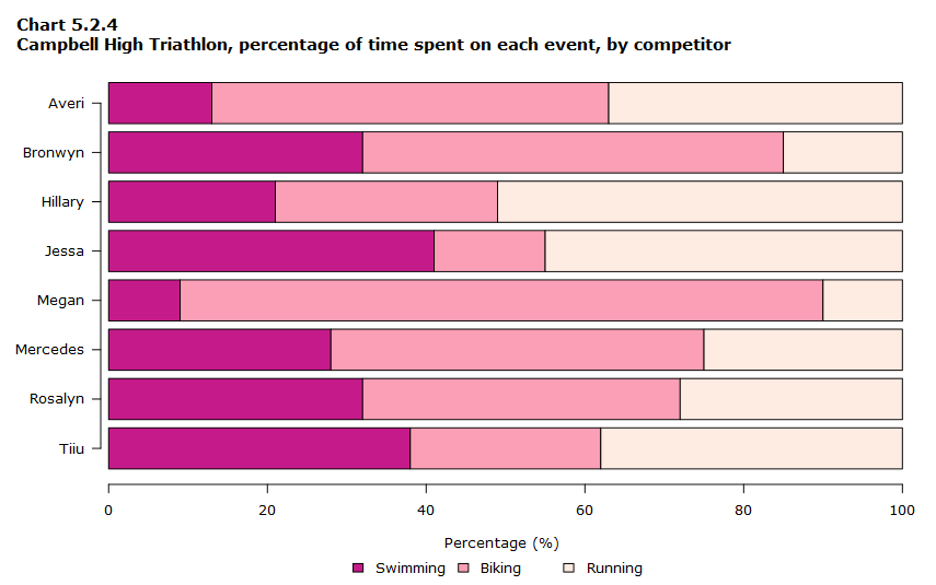
Stacked bar chart example: Campbell High Triathlon, percentage of time spent on each event, by competitor
Text version
Percentage of time spent swimming, cycling and running by participant
| First name |
Percentage of time spent swimming (%) |
Percentage of time spent cycling (%) |
Percentage of time spent running (%) |
| Averi |
13 |
50 |
37 |
| Bronwyn |
12 |
53 |
15 |
| Hillary |
21 |
28 |
51 |
| Jessa |
41 |
14 |
45 |
| Megan |
9 |
81 |
10 |
| Mercedes |
28 |
47 |
25 |
| Rosalyn |
32 |
40 |
28 |
| Tiiu |
38 |
24 |
38 |
As shown in this example, stacked bar charts are useful for showing how a whole is divided across more than two categories. This chart displays how each competitor's total race time is divided among swimming, biking, and running.
Line charts
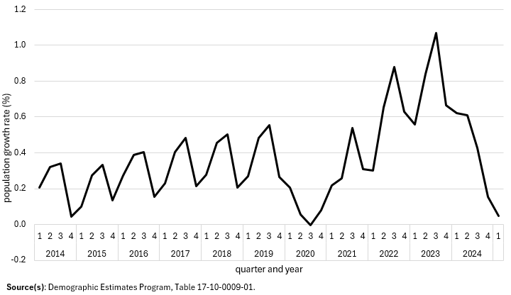
Line charts are another common and effective way to visually portray data and its characteristics in a way that is easy to detect at first glance. By connecting data points with a continuous line, line charts show a comparison of how a variable on the x-axis compares in relation to the variable on the y-axis, and how they are related to or vary from each other. Line charts are especially useful for highlighting trends, irregular rises and declines, as well as points of stability or volatility.
Rather than showing individual points, line charts are useful in displaying how each of the points relate to one another, as well as how they differ from each other as well. This is well suited for tracking or monitoring across time and examining long-term patterns.
Line chart example
Quarterly population growth rate, Canada, 2014 to 2025
Text version
Quarterly population growth rates for Canada, 2014 to 2025
| Year |
First quarter |
Second quarter |
Third quarter |
Fourth quarter |
| 2014 |
+0.2% |
+0.3% |
+0.3% |
+0.0% |
| 2015 |
+0.1% |
+0.3% |
+0.3% |
+0.1% |
| 2016 |
+0.3% |
+0.4% |
+0.4% |
+0.2% |
| 2017 |
+0.2% |
+0.4% |
+0.5% |
+0.2% |
| 2018 |
+0.3% |
+0.5% |
+0.5% |
+0.2% |
| 2019 |
+0.3% |
+0.5% |
+0.6% |
+0.3% |
| 2020 |
+0.2% |
+0.1% |
-0.0% |
+0.1% |
| 2021 |
+0.2% |
+0.3% |
+0.5% |
+0.3% |
| 2022 |
+0.3% |
+0.7% |
+0.9% |
+0.6% |
| 2023 |
+0.6% |
+0.8% |
+1.1% |
+0.7% |
| 2024 |
+0.6% |
+0.6% |
+0.4% |
+0.2% |
| 2025 |
+0.0% |
|
Source(s): Statistics Canada, Demographic Estimates Program, Table 17-10-0009-01.
As shown in this example, line charts are useful for showing how values change over time. This chart displays quarterly population growth rates in Canada from 2014 to 2025, highlighting fluctuations and overall trends across the period.
Pie and donut charts
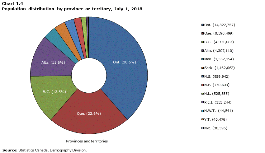
Pie charts and donut charts are nearly identical in essence but as the name suggests, pie charts are whole full circles, while donut charts have a hollow centre, making it easier to compare the proportions of data. These charts are commonly used to present data that are relative in size and of proportion to different data points that generally make up one whole dataset.
However, pie and donut charts should be used with caution. While they are intended to show proportions of a whole, its reliance on angles and visual area can be difficult to interpret accurately. Matching labels to slices can be difficult, with smaller segments being much harder to identify and accurately compare.
Donut chart example
Population distribution by province or territory, July 1, 2018
Text version
Proportion by province and territory
| Province or territory |
Proportion |
| Ont. |
38.6% |
| Que. |
22.6% |
| B.C. |
13.5% |
| Alta. |
11.6% |
| Man. |
3.6% |
| Sask. |
3.1% |
| N.S. |
2.6% |
| N.B. |
2.1% |
| N.L. |
1.4% |
| P.E.I. |
0.4% |
| N.W.T. |
0.1% |
| Y.T. |
0.1% |
| Nvt. |
0.1% |
As shown in this example, donut charts are useful for showing how a total is divided among categories. This chart shows the share of Canada's population by provinces and territories.
Scatterplot graphs
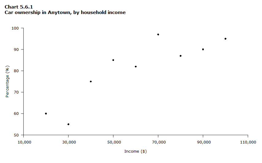
Scatterplot graphs are much more common in analytical and research contexts, where the goal is to examine relationships between variables, rather than comparisons. This visualization is used to show alignment between two variables when one variable is thought to be dependent on the other, with the goal to see whether the two move together, diverge, or show no relationship.
While scatterplot graphs can suggest that a relationship may exist, they cannot confirm it on their own. Formal statistical analysis is required to determine whether an observed relationship is meaningful or statistically significant.
Scatterplot graph example
Car ownership in Anytown, by household income
Text version
Income and percentage
| Income ($) |
Percentage (%) |
| 20,000 |
60 |
| 30,000 |
55 |
| 40,000 |
75 |
| 50,000 |
85 |
| 60,000 |
82 |
| 70,000 |
97 |
| 80,000 |
87 |
| 90,000 |
90 |
| 100,000 |
95 |
As income levels increase, a general pattern emerges showing higher rates of car ownership among higher income households. This visual relationship supports the interpretation that car ownership tends to be more common as household income rises, highlighting income as an important factor associated with access to and affordability of vehicle ownership.
Histograms
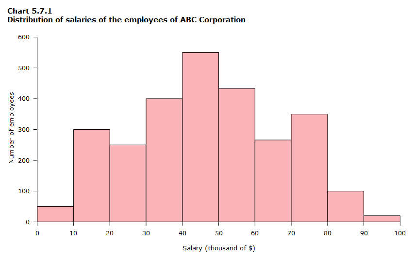
Histograms are commonly used to show how data is spread out across a range of values. Rather than placing focus on individual data points, it highlights the importance of ranges, clusters, gaps, and more. In other words, the key point of histograms is to display the distribution of a variable. One of the strengths of histograms is that they're very effective for identifying outliers as it is easy to detect unusual data points with the eye.
Histogram example
Distribution of salaries of the employees of ABC Corporation
Text version
Number of employees by salary range
| Salary (in thousands of $) |
Number of employees |
| 0-10 |
50 |
| 11-20 |
300 |
| 21-30 |
250 |
| 31-40 |
400 |
| 41-50 |
550 |
| 51-60 |
433 |
| 61-70 |
266 |
| 71-80 |
350 |
| 81-90 |
100 |
| 91+ |
20 |
As shown in this example, histograms are useful for showing the distribution of a continuous variable. This chart displays the distribution of employee salaries at ABC Corporation, with bars representing the number of employees within each salary range.
Histogram with outlier example
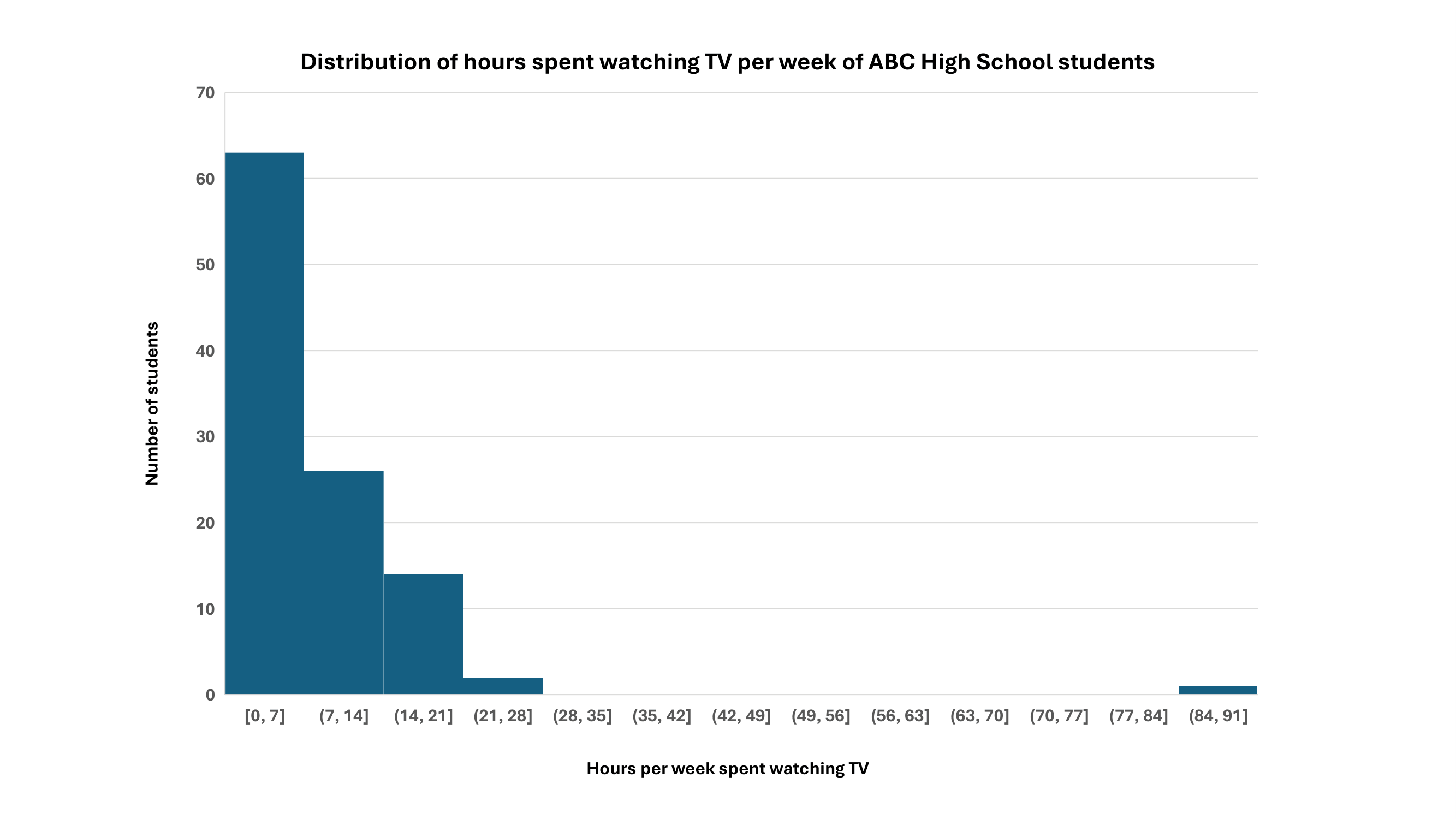
Distribution of hours spent watching TV per week of ABC High School students
Text version
Hours per week spent watching TV by ABC High School students
| Hours/Week Watching TV |
Number of ABC High School Students |
| 0 | 10 |
| 1 | 4 |
| 2 | 4 |
| 3 | 8 |
| 4 | 7 |
| 5 | 5 |
| 6 | 8 |
| 7 | 17 |
| 8 | 1 |
| 9 | 3 |
| 10 | 2 |
| 11 | 9 |
| 13 | 4 |
| 14 | 7 |
| 15 | 9 |
| 17 | 2 |
| 20 | 2 |
| 21 | 1 |
| 22 | 2 |
| 86 | 1 |
As shown in this example, histograms are useful for showing how data is distributed across a range of values. This chart shows that most reported TV viewing hours are clustered between 0–7 hours per week, while one value of 86 hours stands far apart from the rest. This shows a clear outlier within the dataset that is easy to detect because it is visually separated from the main cluster of values.
Maps
Maps are one of the most familiar visual tools we encounter that provides geographic reference to help situate spatial information, allowing conclusions to be drawn about how the data relates to set locations. In other words, traditional maps are used when we want to specifically display geospatial data.
Map example
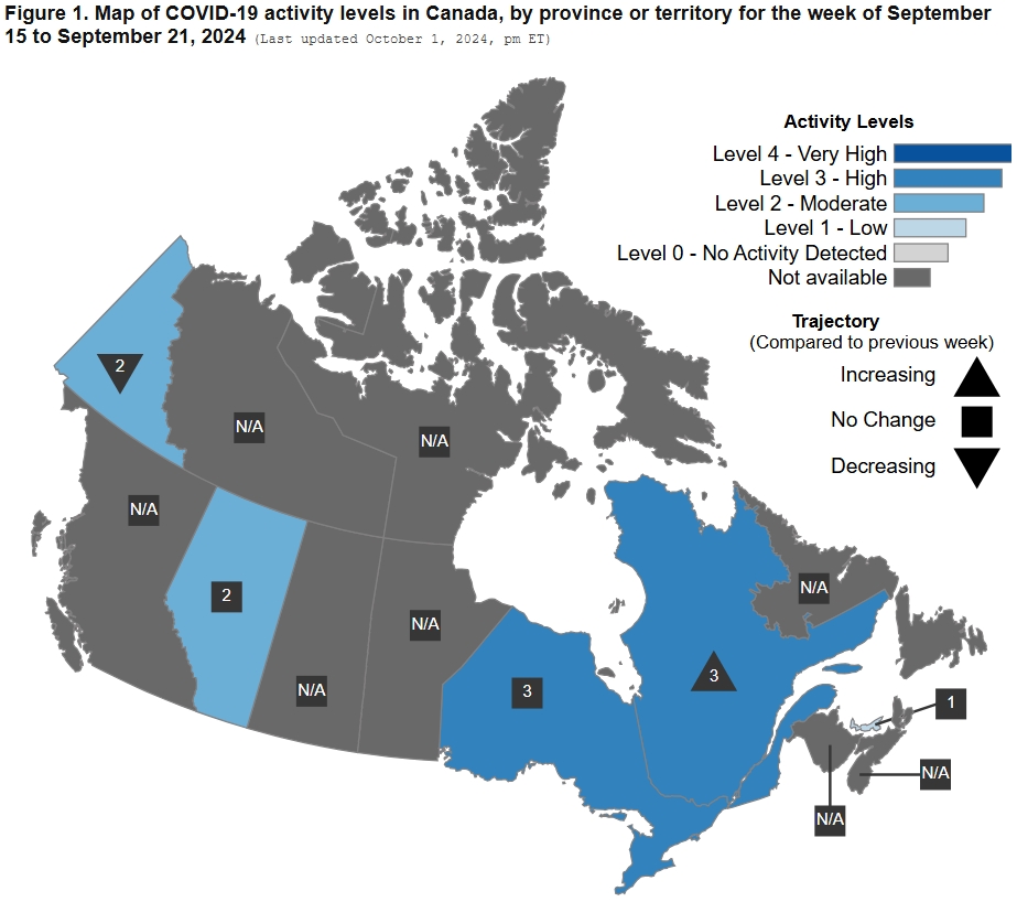
Map of COVID-19 activity levels in Canada, by province or territory for the week of September 15 to September 21, 2024
Text version
Map of Canada showing COVID-19 activity levels for September 15-21, 2024. Saskatchewan and Manitoba are at Level 2 (Moderate), Ontario and Quebec are at Level 3 (High), and Newfoundland and Labrador are at Level 1 (Low). Activity is decreasing in Saskatchewan and Quebec, increasing in Ontario, and unchanged in Newfoundland and Labrador. Activity level data are not available for British Columbia, Alberta, Yukon, Northwest Territories, Nunavut, New Brunswick, Nova Scotia, and Prince Edward Island.
As shown in this example, maps are useful for showing geographic patterns. This map shows COVID-19 activity levels across provinces and territories in Canada using colour to represent differences between regions.
Heat maps
Heat maps are a visual technique of data that uses colour on a two-dimensional map or grid to represent the values or two or more variables. In other words, heat maps use variations of colours to indicate patterns, concentrations, or differences in data, making it easier to see where values in data are higher or lower across a set of variables. It is important to note that heat maps do not need to be related to geography at all; although, there can be geographic maps that are also heat maps.
Heat map example
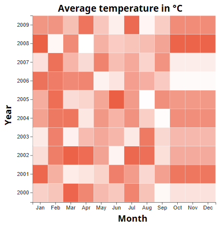
Average Monthly Temperatures from years 2000 to 2009
Text version
This chart displays average monthly temperatures from 2000 to 2009, with colour intensity representing variation across months and years.
Note: Colour-coded maps and heat maps should always be accompanied by a legend that specifies what the colours represent, so viewers can interpret the data.
Non‑geographic heat maps like this are useful for showing how values vary across two dimensions using differences in colour. For non‑geographic maps like this, a legend is essential to clearly indicate what each colour or element represents and to support accurate interpretation.
How to choose the right visualization
Consider what the data is telling the audience. How is it best delivered? For example, you wouldn't use a heat map to show changes over time of the number of customer ordering ice cream throughout the year because heat maps are not designed to display data that progresses and change over time. When selecting the right type of data visualization, always ask yourself the following questions:
- What type of variable(s) am I working with? (for example, frequency 1, mean 2, percentage 3, percentile 4, rate 5, ratio 6, regression coefficient 7, etc.)
- What am I trying to show? (for example, values, a comparison, change over time, a relationship, a distribution, geographic differences, etc.)
- What should the visualization help them understand? What should they take away from the visualization?
Visualization tools
To create these visuals that work alongside the narrative to complete the bigger picture, various data visualization tools can be used. Data visualization tools are software applications and platforms that enable users to create and share data visualizations that help bridge the gap between data and insight. The following are some tools that can be used to produce and share visualizations:
Microsoft PowerPoint
As part of one of the main Microsoft Suite applications, PowerPoint offers an extensive variation of visualizations including bar (both 2D and 3D), line, and pie charts, scatterplot graphs, maps, histograms, funnel charts, combinations, and more. PowerPoint further offers built-in custom infographic functions and SmartArt features, which allow users to visually organize information and combine text with simple graphics to support communication.
Microsoft Excel
Microsoft Excel also offers an extension suite for data visualization, turning raw numbers and data into visuals. Excel offers various functions (similar to PowerPoint), ranging from basic and core functions like charts (bar, line, pie), to other functions like conditional formatting, PivotTables and PivotCharts, Sparklines, Power Maps, Visio Data Visualizer, and more. Together, these features allow users to summarize and present data visually within a spreadsheet environment.
Dashboard tools
Dashboard tools like Tableau and Power BI are applications used for intuitive data visualization, offering detailed analytics and interactive dashboards. Creating expandable dashboards and reports among other common visualizations, dashboard tools are commonly used when deeper analysis is needed or when working with larger datasets. These tools are also more accessible than custom applications in that they do not require proficiency in coding.
Custom Data Applications
When users want to fully customize the logic behind visualizations, custom data applications such as Shiny or Streamlit are often used. They are more flexible than traditional dashboard tools and enable the creation of visualizations where users can actively engage with complex models by modifying inputs and parameters to test scenarios. However, these custom applications are less accessible because they often require proficiency in coding in R or Python. Remember to always check or request approval from your department's IT team before using new tools and ensure that no sensitive data is uploaded.
Key considerations for data visualization
Prior to building the visualization, reflecting on key considerations that influence how a data visualization is designed and best interpreted is crucial. The following considerations help inform decisions made throughout the visualization process:
-
Consider who the audience is. Are they beginners with limited to no knowledge of the data and how to interpret visualizations? Or are they technical experts who have the background to easily interpret and understand the data? What is the purpose of the data for this audience, and how will it be used (e.g., to inform decisions, identify trends, or guide actions)?
-
Select the right type of data visualization. What is it about the data that you want to convey? Does the visualization type match the data you're trying to present? Which type will communicate the information most effectively?
-
Consider the purpose and key takeaway of the visualization. Is the visualization you've chosen accurately conveying the results of your analysis? What insight should the audience take away from it? Your visual choice should reinforce the main message.
Best practices for data visualization
Taking the considerations above into account, it is important to employ best practices accordingly to ensure the most effective and accessible data visualization experience for everyone. The following is a non-exhaustive list of best practices that can help achieve this:
- Set the context and provide structure. Introduce the context of and provide background information on the data being displayed in the visualization. This helps frame the data and supports clearer, more accurate interpretations.
- Practice good "labelling" and organization. Use clear titles, labels, legends (if applicable), and logical ordering to help users understand the data. Also do your best to make sure all the text on the visualization remains horizontal for reading ease.
- Always consider accessibility, make design choices accordingly, and test the visualizations for potential barriers. Ensure that the design of the data visualizations is both readable, interpretable, and usable by diverse audiences, including individuals with accessibility needs; this includes using clear text, appropriate size of text, sufficient colour contrast, simple visual structures, and using alt text and long descriptions, among other features.
- Ensure the availability of supplemental format choices. Ensure the availability of supplemental format choices, such as data tables, downloadable datasets, or text summaries, in case the original visualization may not be accessible, usable, or preferred by all users.
How do visualizations contribute to storytelling and vice versa?
All of these pieces come together to state that data visualization is about turning raw data into simpler formats, such as charts and graphs, that can be interpreted. When combined with the interpretation of the data, storytelling is the connecting piece that adds context and explains the "why" behind the data. Together, data visualization and storytelling help frame interpretation by leading individuals through the questions of "what, so what, now what?"
One way to think about this relationship is through a simple equation:
data + visualizations + storytelling = the whole picture
The brain understands visual information much faster than any other stimuli, making data visualizations one of the most effective ways to present information and convey meaning. Accompanied by the narrative and storytelling, the meaning that comes from the visual insights can be used to turn meaning into informed action.
Conclusion
Data visualization is not simply about creating charts and graphs or presenting the numbers. It is about helping people understand the data in a way that is meaningful and usable. On its own, data provides the factual foundation through numbers; visualizations make the patterns and insights easier to detect by eye; when coupled with storytelling, we are able to explain the "why" behind the data.
Storytelling plays an important role by connecting interpretation with meaning. It helps explain what the data shows, why it matters, and what can be taken from it. For public servants, the goal is to use data visualization thoughtfully to support communication of data and support decision-making. This means knowing how to select appropriate visual formats, understanding how to interpret the visualizations, considering the needs of different audiences, and ensuring the message is clear, contextualized, and grounded in a coherent narrative.
As tools and approaches continue to evolve, so will the expectations around how data is communicated. By combining strong data practices with thoughtful design and clear storytelling, public servants can use data visualization to support transparency, strengthen understanding, and inform better decisions.
Definitions
- Frequency
- The number of times a value, category, or result occurs in a dataset.
- Mean
- The average value of a dataset, calculated by adding all values together and dividing by the total number of values.
- Percentage
- A value expressed as a proportion out of 100.
- Percentile
- A measure that shows the point below which a certain percentage of values in a dataset fall. For example, the 75th percentile is the value that is higher than 75% of the data.
- Rate
- A measure that shows how often something occurs within a specific population or period of time.
- Ratio
- A comparison between two quantities that shows the relative difference in their size.
- Regression coefficient
- A measure used to show how much a change in one variable is associated with a change in another variable.
Resources
